Sound of Speed
Advertorial one-pager created for Red Bulletin to promote Audio Technica and their products used at MotoGP. Designed in Figma, built in Ceros. Adapted across three languages (GB, FR, DE).
Scan the QR code to view mobile.
Services
Digital design // UX // Build
Software
Figma // Ceros
Clients
Red Bulletin // Audio Technica
Agency
H Labs
Studio Obscura
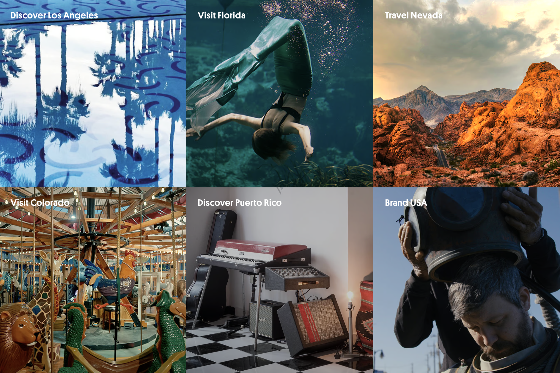
Travel magazine Atlas Obscura requested a website to showcase their brand partnerships with the likes of YouTube, Hendrick’s, Netflix, Nissan, Timberland and Land Rover.
The challenge was to find a compelling way to showcase Atlas Obscura’s portfolio using a single-page format, without code, and to encourage click-through using a ‘contact’ button.
I structured, designed and built Studio Obscura within the tight two week deadline, fulfilled the brief, and received excellent feedback (totally nailed it!) with no design amends.
Services
Digital design // UX // Build
Software
Figma // Ceros
Client
Atlas Obscura
Agency
H Labs
Hiroshima
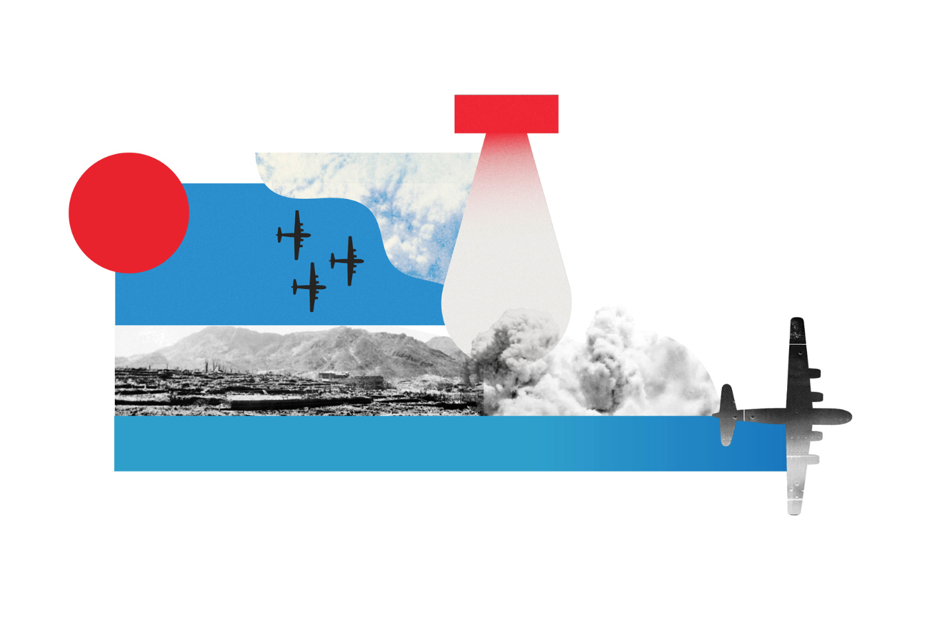
A long form article designed for The Telegraph, which acknowledged the 75th anniversary of the Hiroshima atomic bomb. Scoped out requirements, wireframed layout, then commissioned illustrators and graphic artists before pulling everything together into one cohesive, responsive design.
Received an Award of Excellence from the Society of News Design
Services
Digital design // UX
Additional services
Image and video sourcing // Graphics commission
Software
Figma // Premiere Pro
Client
The Telegraph
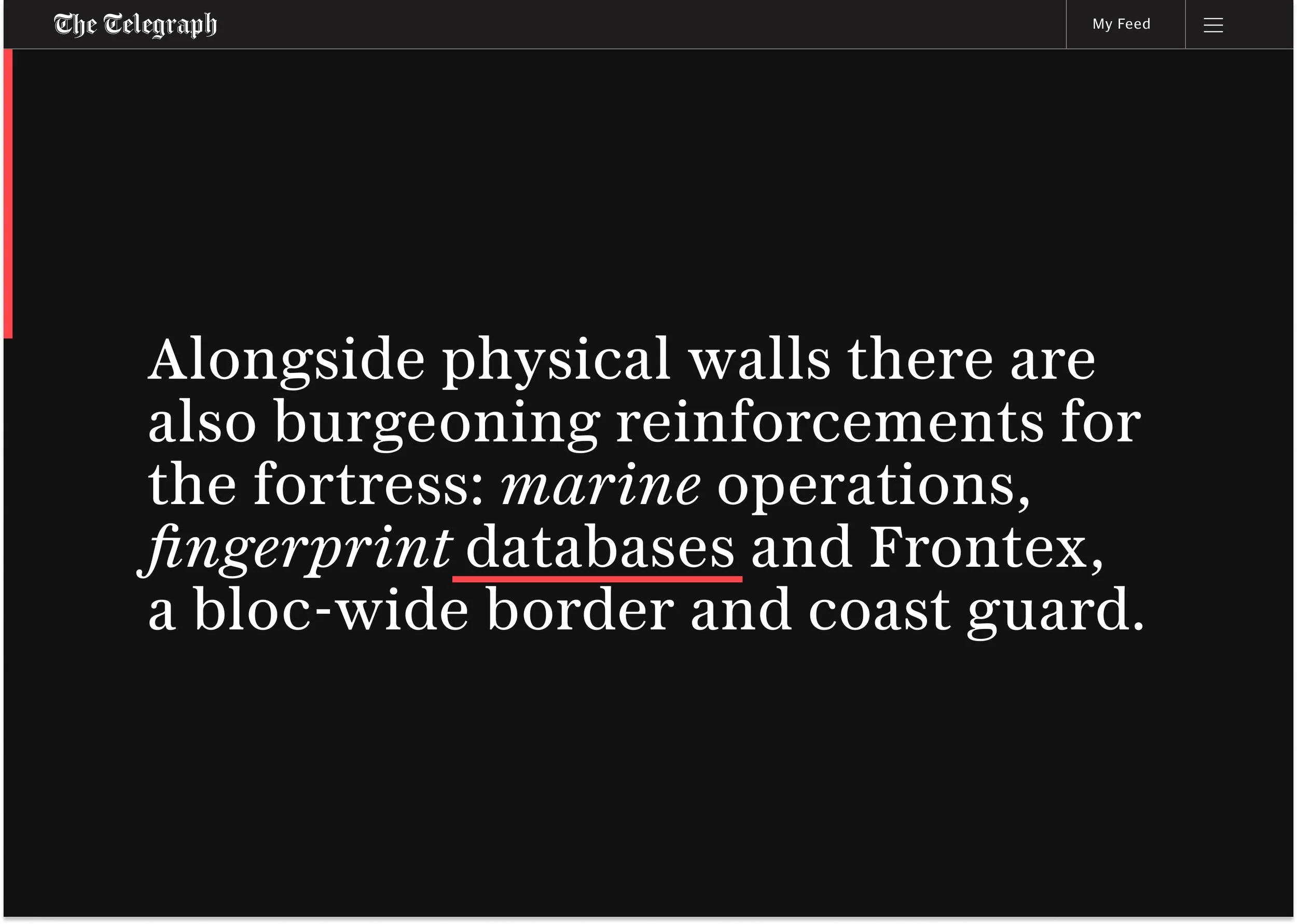
Fortress Europe
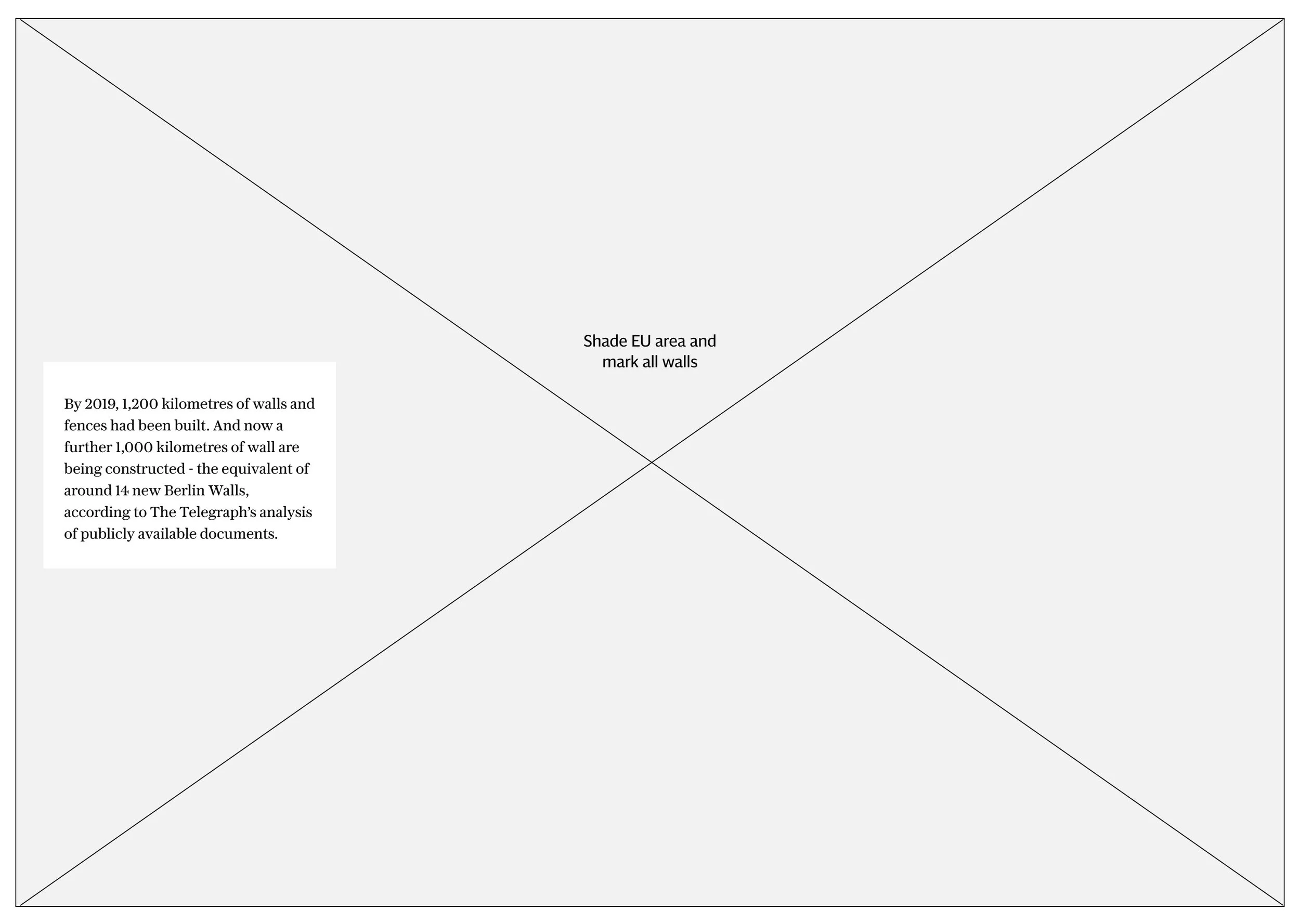
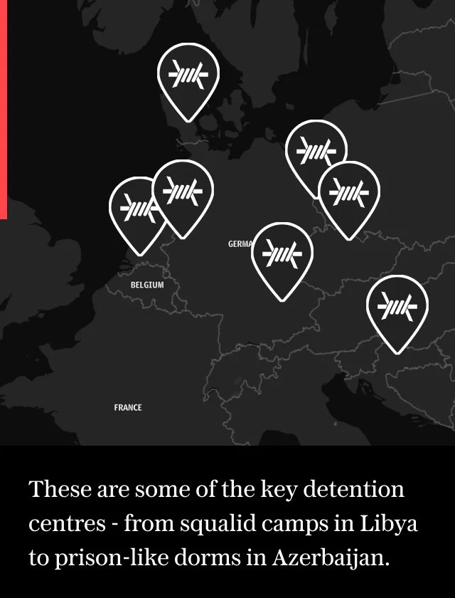
An investigative piece designed for The Telegraph, which focused a spotlight on the border control measures quietly being implemented across Europe. This required a considered layout of complex information, using visual storytelling technique to pull together maps, statistics, photography and copy in a way that conveyed the true impact of these borders on human lives.
Received an Award of Excellence from the Society of News Design
Services
Digital design // UX
Software
Figma
Client
The Telegraph
1,000 Dream Trips
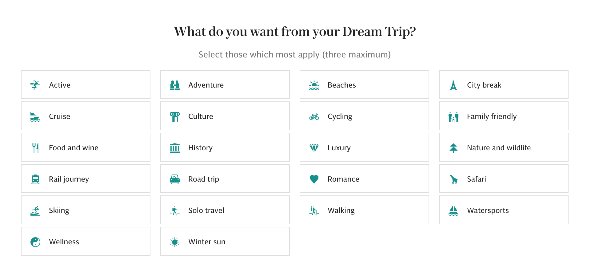
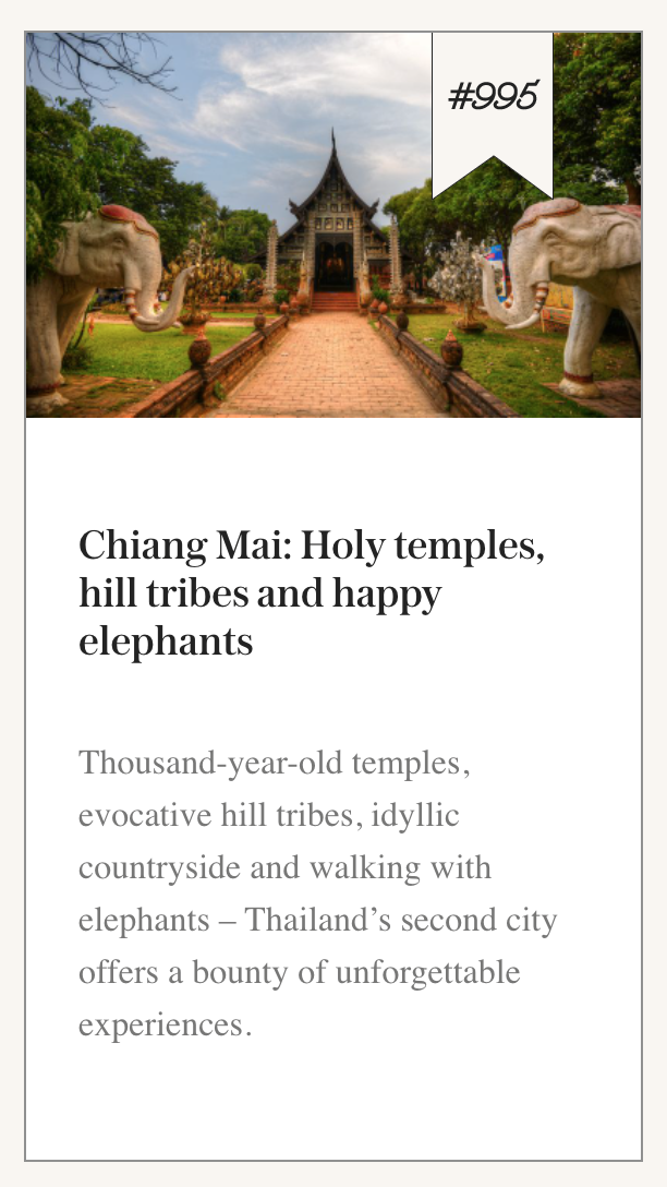
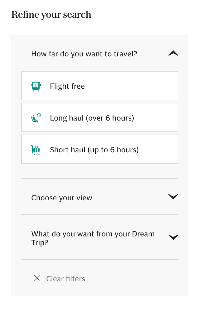
1,000 Dream Trips is a content hub designed to inspire readers based on their travel preferences. This evergreen site required conceptualising and wireframing before applying UI, in order to understand how best to engage the user and materialise their dream trips!
Services
Digital design // UX
Additional services
Video sourcing & editing
Software
Figma // Premiere Pro
Client
The Telegraph
Condé Nast
Analytics also showed that Condé Nast’s “specs and features” modules were another low performer in terms of click through rate. I reviewed two of their module designs (shown below), gave UX feedback, and proposed new designs.
Services
Digital design // UX // Build
Software
Figma // Ceros
Clients
Condé Nast
Agency
H Labs
Previous design
Readers need a reason to engage; they don't know what's behind the hotspot icons, so are not motivated to click.
Duplicated product images are confusing
Pop ups are fiddly to close on mobile
Hover behaviour cannot be recorded on desktop
Recommendations
Option #1
Editorial format integrates seamlessly with the page
No hidden copy; purpose of the module is clear
Compatible with copy of varying lengths, not restricted by borders or character counts
Works with both singular and multiple products
Recommended for portrait product images
Option #2
No hidden copy - purpose of the module is clear
Extra 'learn more' CTA on mobile gives reader another opportunity to convert
Works with both singular and multiple products
Lends itself to portrait product images
Condé Nast
Analytics showed that Condé Nast’s shoppable galleries were one of their lowest performing modules for click through rate. In order to visualise collaborations between this publisher and their brands in a way that successfully increased dwell time and click through rates, I reviewed their Marc Jacobs gallery, gave UX feedback, and proposed new designs.
Services
Digital design // UX // Build
Software
Figma // Ceros
Client
Condé Nast
Agency
H Labs
Previous design
Not clear that images are interactive
Readers need a reason to engage; they don't know what’s behind the interaction so are not motivated to click
Long load time on mobile
Recommendations
Option #1
Display all content and avoid use of pop-ups, reducing the opportunity for content to be missed
Optimise images for faster loading speed
Recommended for up to six products
Option #2
Carousel option for a larger number of products
Reader is in control of the flow of information
Product information, CTA and navigational arrows make it clear this is a shoppable gallery, giving users incentive to interact
Numbered pages indicate how many products there are to browse
Separate product image for clarity
Option #3
Alternative carousel design, suitable for unlimited products
Reader is in control of the flow of information without being overwhelmed
Product information, ‘shop now’ CTA and navigational arrows make it clear this is a shoppable gallery, giving users incentive to interact with it.


